project 05

Maptycs

  • Branding Identity
  • UX
  • UI

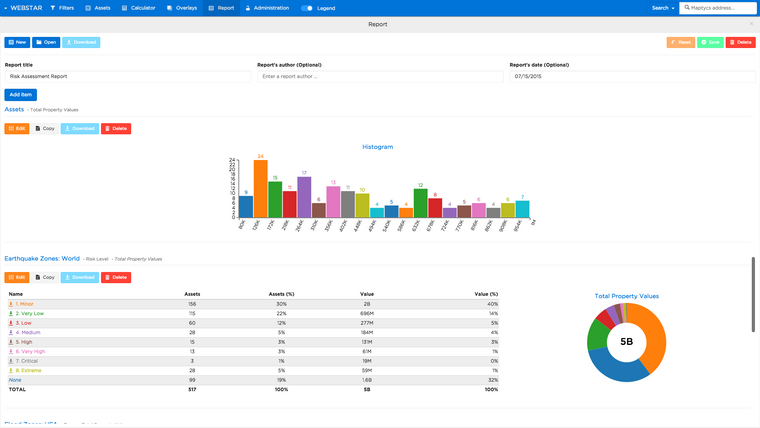
Maptycs is a risk Analytics system that helps risk and insurance professionals maximize the value of information. Maptycs transforms and consolidates your risk and insurance data making it not only easier access, but also easier to analyze and spot trends.

Project Overview

Year
2014
Timeline
2 years
Design
10 months
Platforms
Devices

Challenge

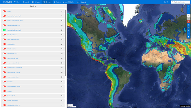
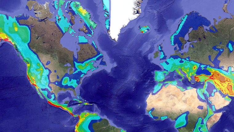
Risk managers, CFO's, and insurance brokers needed a new web application to help consolidate data from assets, claims, and policies that had been spread over e-mail, hard-drives, and paper sources. Risk managers especially needed to compare their data against 3rd party data events such as FEMA flood zones, California EQ Zones, and historical event data. Live event and weather data is also especially important for clients with international portfolios. Maptycs presented three main challenges — development of a visualization tool to consolidate users' data, sync the tool with API's with useful 3rd party data, and to explore what could be possible in future iterations.
Solution

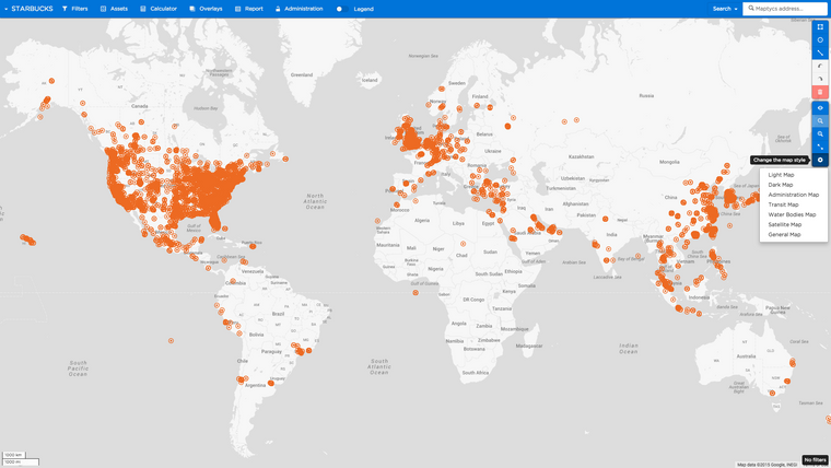
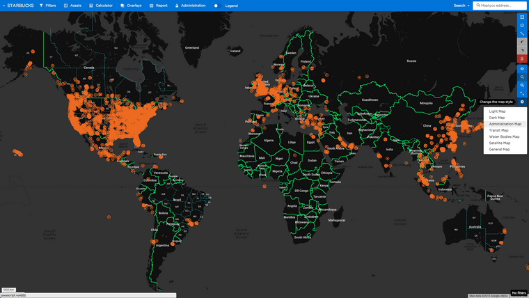
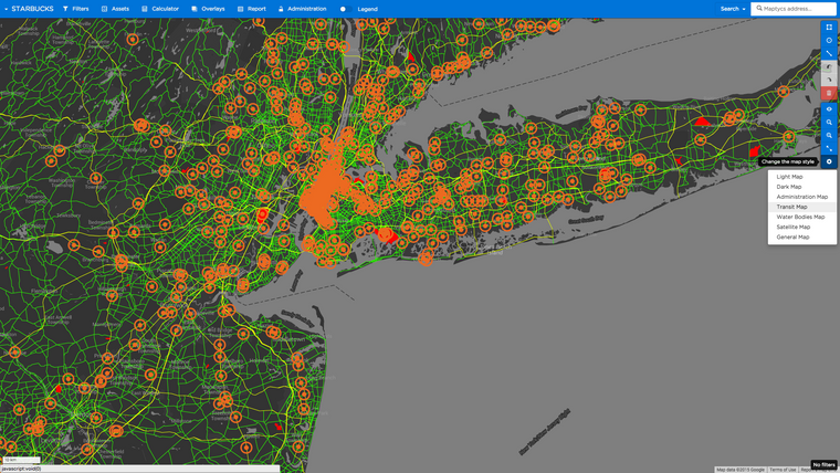
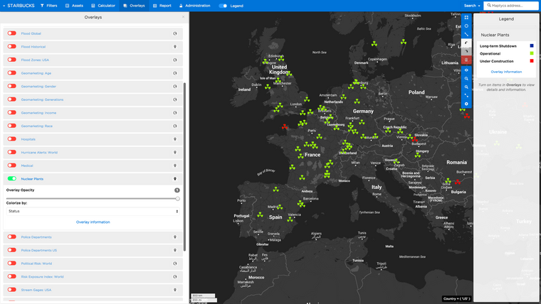
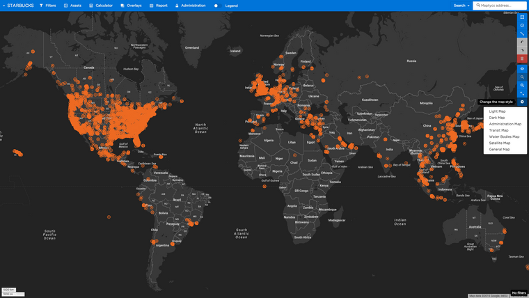
Because users primarily focused on proximity & spatial relationships rather than aggregate statistics on a day to day basis. Special colorized maps were designed so users could view their plotted assets in different contexts. Map options emphasized transport, administration zones, bodies of water, and terrain topography. Clusters, heat maps, measuring tools, and filtering tools in which users could draw complex shapes or regions to select assets within were all made available to the user. An enormous amount of supplemental open source data was uploaded into the application. Users could turn off & on nuclear plants, fire stations, police departments, hospitals, airports, and civic institutions.

Maptycs -
Maptycs -
Maptycs -
Maptycs -
Maptycs -
Maptycs -
Maptycs -
Maptycs -
Maptycs -